This was a three-day project to build an experimental map for the Centre for Sustainable Fashion (CSF) at the University of the Arts London. It’s an attempt to visually represent the connections between the different parts of the textile industry. (The data in these screenshots is anonomised.)
CSF had gathered data about who in the textile industry was working with (or connected with) who. I was asked to look at ways in which this data could be represented and navigated. This prototype is the result of the first set of work, produced in March 2014. A subsequent version is planned for the Summer.
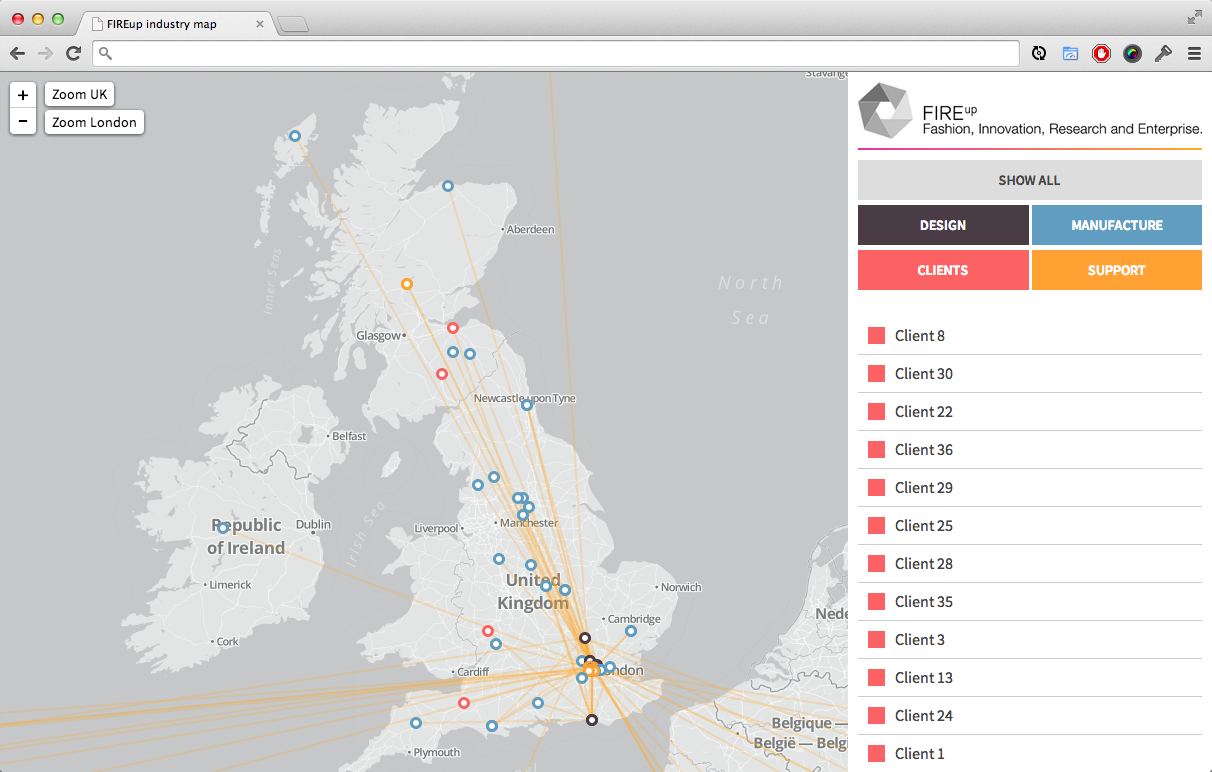
This tool takes the dataset gathered by CSF and categorises it into designers, manufacturers, clients, and support. Selecting one of the four broad categories from the menu on the right highlights the selected one and shows how the different parts of the industry are distributed geographically. For example, the vast majority of clients are located in the South East, whereas manufacturing (blue dots in the image below) is more broadly distributed.
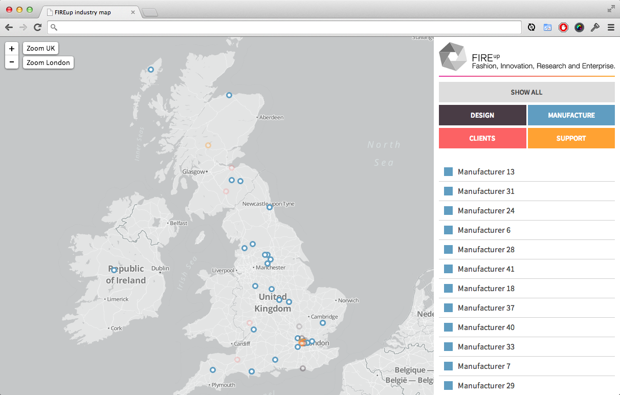
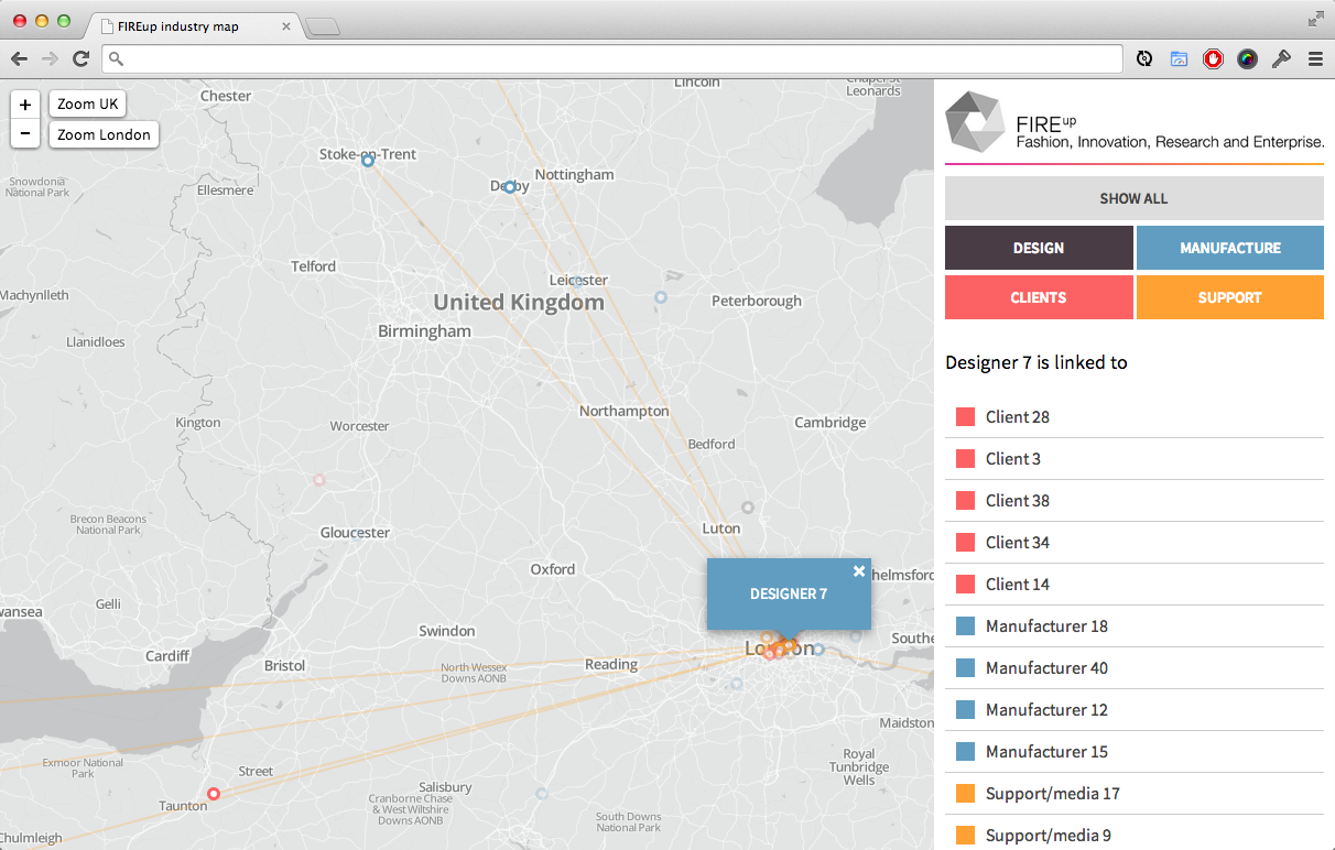
Selecting a point (e.g. a designer) shows how that point is linked to other entities on the map. This is shown both on the map itself with connecting lines, and in the sidebar, where linked entities can be clicked, allowing you to navigate through the network from point to point.
Another important piece of work on this project was converting the data from spreadsheets into a very simple workflow for adding new data and connecting the entities with each other, to lower the barrier to adding new information into the tool. This was successfully tested at a workshop where a number of people from the textile industry were provided the data-entry tool on iPads and asked to enter their links directly.
This is project is a work in progress which will develop as the raw data set gets larger, and as we refine the methods of interacting with the data. More soon!